The Problem
When I started my redesign, here are a few key problems I found concerning:
- The page has a 1000px maximum width, with a box shadow on the side, so all contents have a visual feel of being "constrained" inside a 1000px box.
- With a lot of information being on the page, it overwhelms users, especially first time engagement ring buyers, with too much irrelavant prodcuts that are not neccessarily getting them further into the purchasing path.
- The look and feel of the page is simply "plain and boring" rather than "modern and clean".
See Old Homepage
"It looks like the type of website that my grandpa would shop from."
--- Anonymous User
The Brand New Homepage
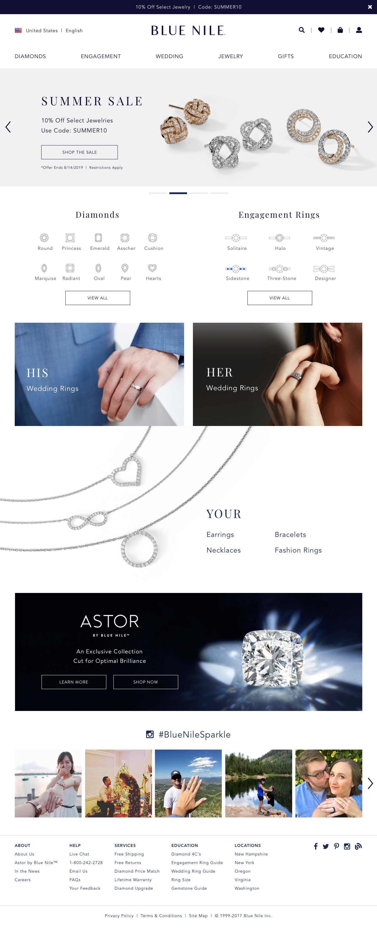
My newely designed Blue Nile homepage resolves all the key issues I found above as well as helping establish a younger brand image:
- With a maximum width of 1280px without any border shadows or boxes, it is visually full width like all other modern websites in the industry.
- The content of this page is limited to cover the product categories that Blue Nile provide, but not too much that overwhelmes users.
- The use of intuitive illustrations easily guide first time engagement ring shoppers into the right product they're looking for.
- Lifestyle photos adds emotional connection between the products and customers, establishes a more vibrant, young and modern brand.
- Adding a section of user generated content on the page helps building trust with first time customers.
My redesign of this homepage follows the same style as my diamond page redesign, which can be found here.
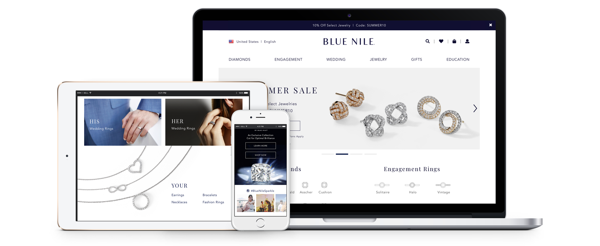
The following is the desktop version of my redesign, click to enlarge. [ Mobile Version ]


