
3 Pages, 11 Weeks
As the lead designer of our Diamond & Engagement Product Team, I was giving the task in May 2018 to have a complete redesign of the 3 major pages in the engagement ring shopping journey within 11 weeks. So that we can leave as much time as we can for our development team, and launch the test of redesigned pages against current experience in Q4. The 3 major pages to be redesigned are:
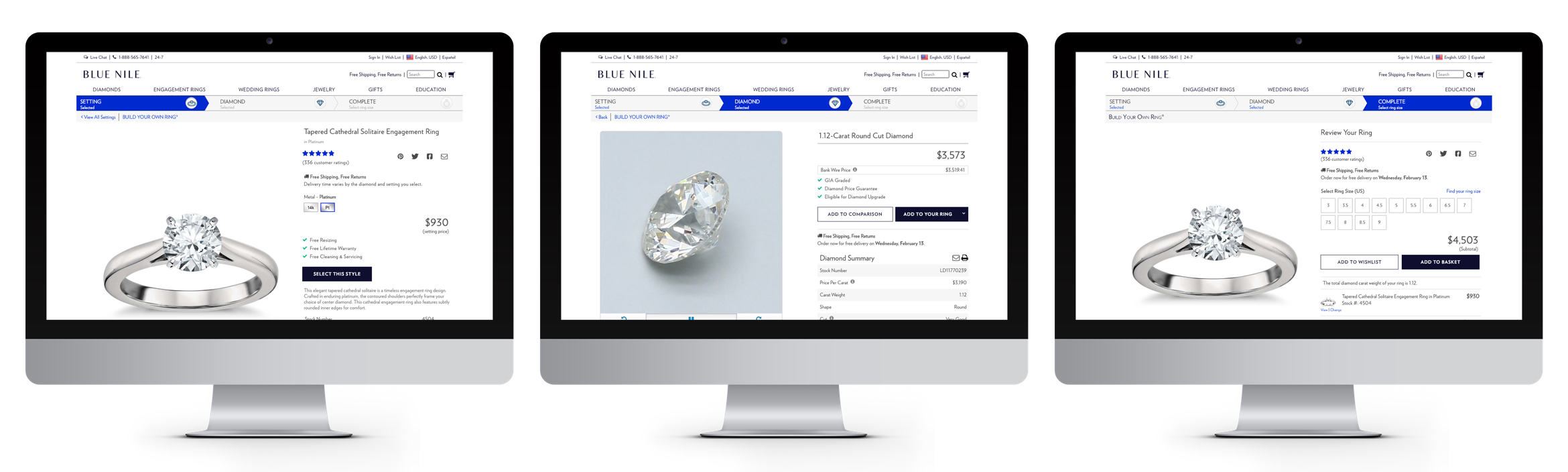
- Ring Style Details Page: Desktop | Mobile
- Diamond Details Page: Desktop | Mobile
- Complete Ring Review Page: Desktop | Mobile
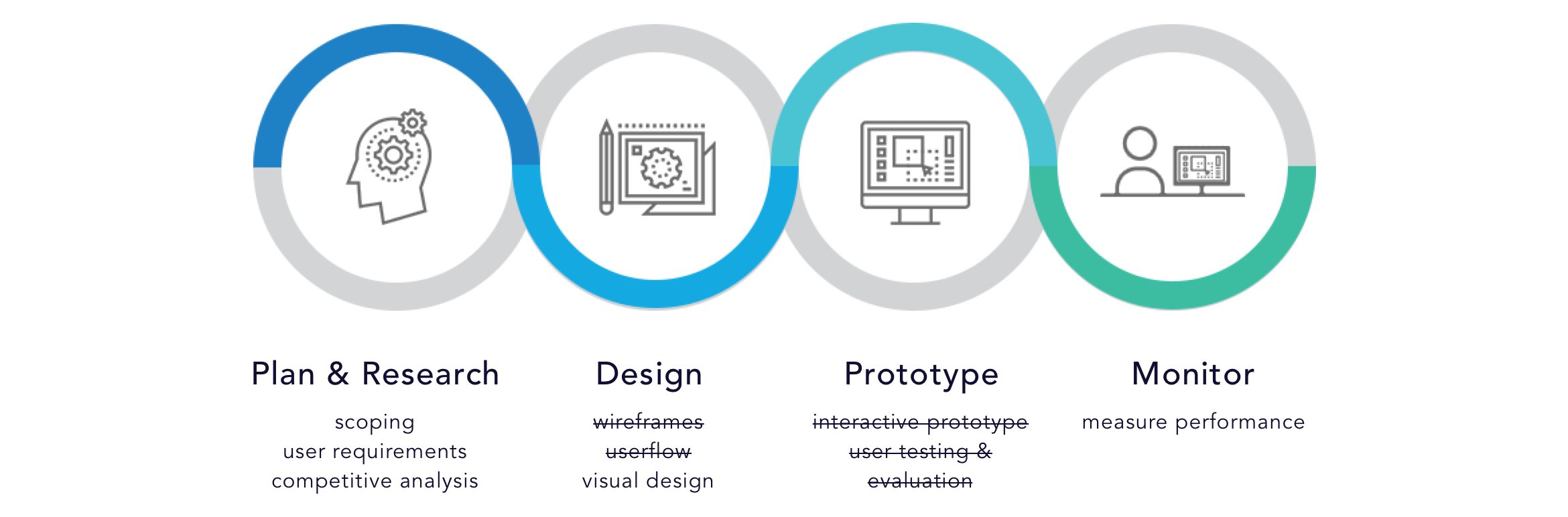
The timeline is an absolute challenge. Not only I need to create a complete redesign of these 3 pages with a short period of time, I still need to support the company's other daily UX tasks at the same time. Therefore, I need to cut almost 50% of the steps I usually do out of my process. I didn't have time to start from wireframe and test my design with real users. Fortunately, I was able to work very closely with our customer service agents and gather lots of great feedback from them since they talk with customers everyday.
The Redesign
Follow the links in below order to get an idea of my redesigned experience:
- Ring Style Details Page: Desktop | Mobile
- Diamond Details Page: Desktop | Mobile
- Complete Ring Review Page: Desktop | Mobile
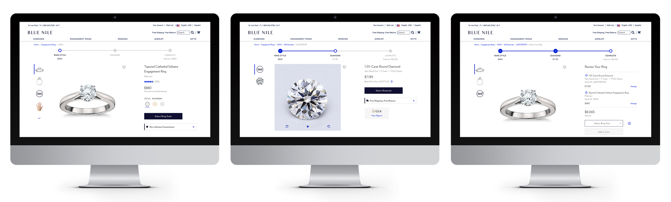
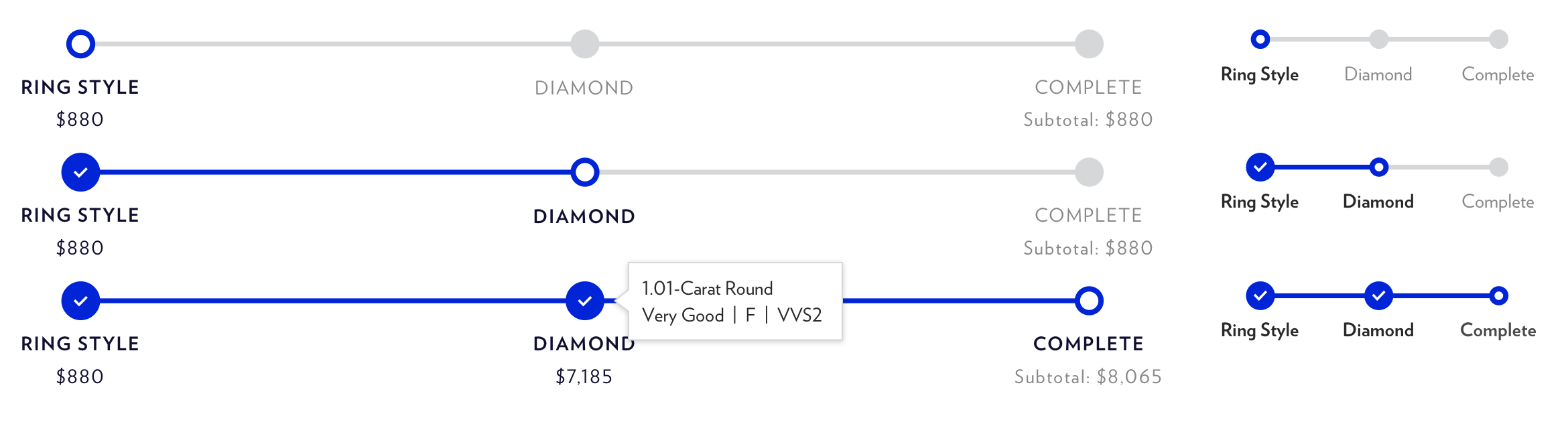
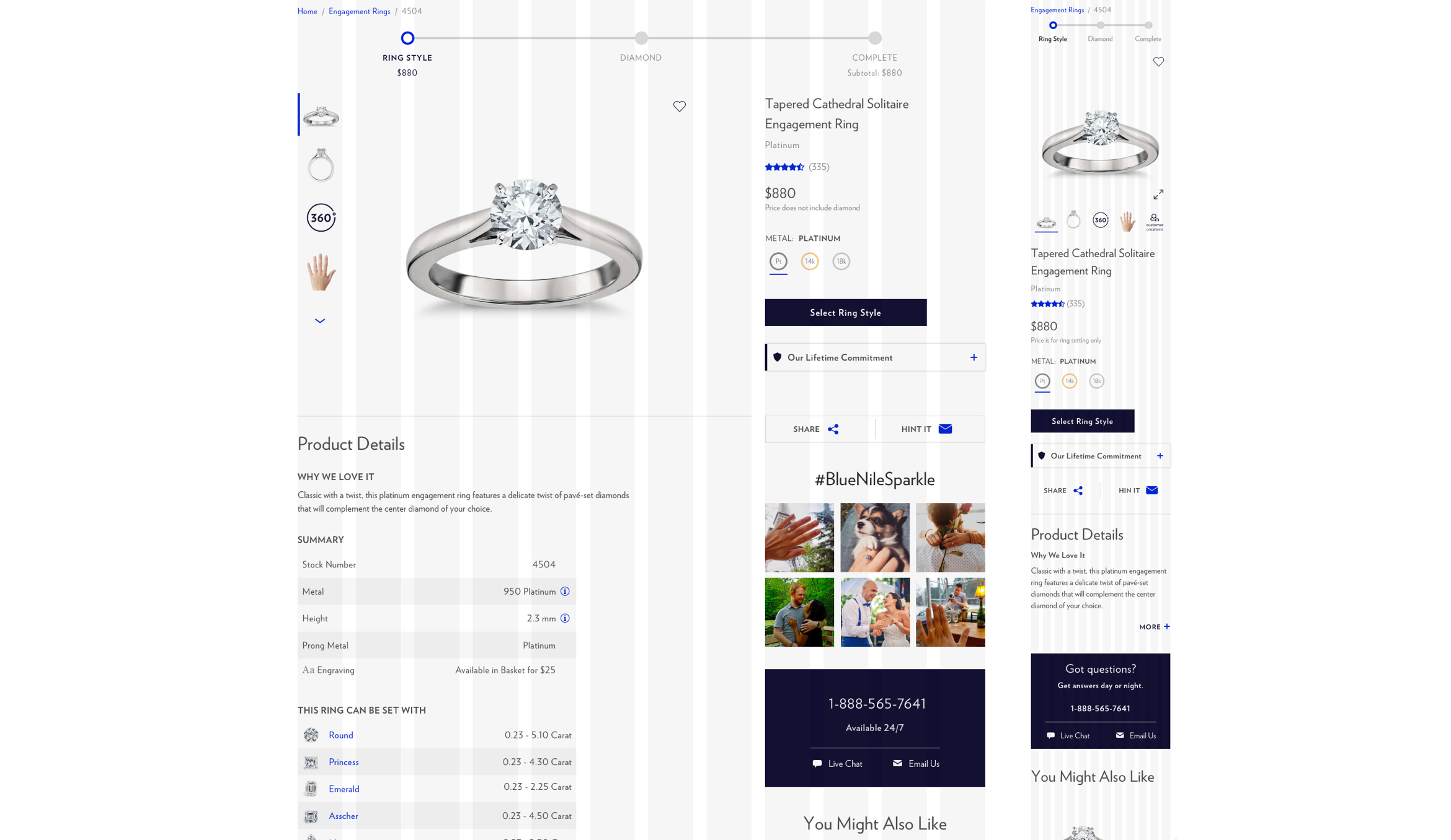
Step-by-Step Progress Bar
To provide a visual guidance to our users throughout the purchase, I designed a step-by-step progress bar at the top of each page. The progress bar shows users where they are at and what to expect next in the process. Users can view a summary of their previous selection without leaving the page by hovering over a specific step on the bar. Also, the price/subtotal information can help users stay in their budget.
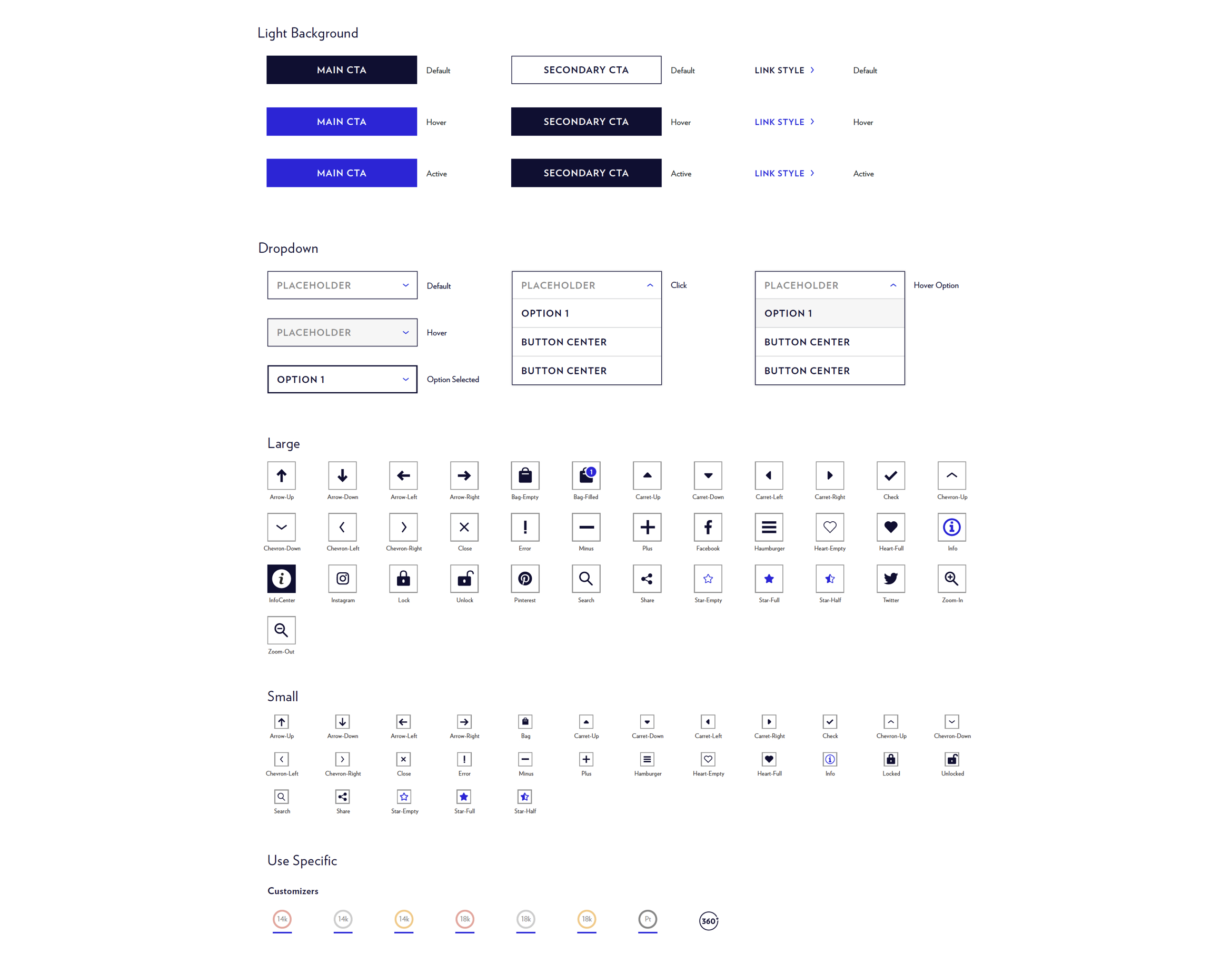
Carbon 1.0 - the New Style Guide
Along with this project, I was working with the lead designer on creating a style guide for Blue Nile. First step was to build a 12-column grid system. This is to create a sense of uniformity across our website. With the use of a 12-column grid system, I can place all of the eyements into rows and perfectly align them with even spacing between all columns.
 We've also defined brand new CTA/Button styles, color usage, icon sets and typography hierarchy:
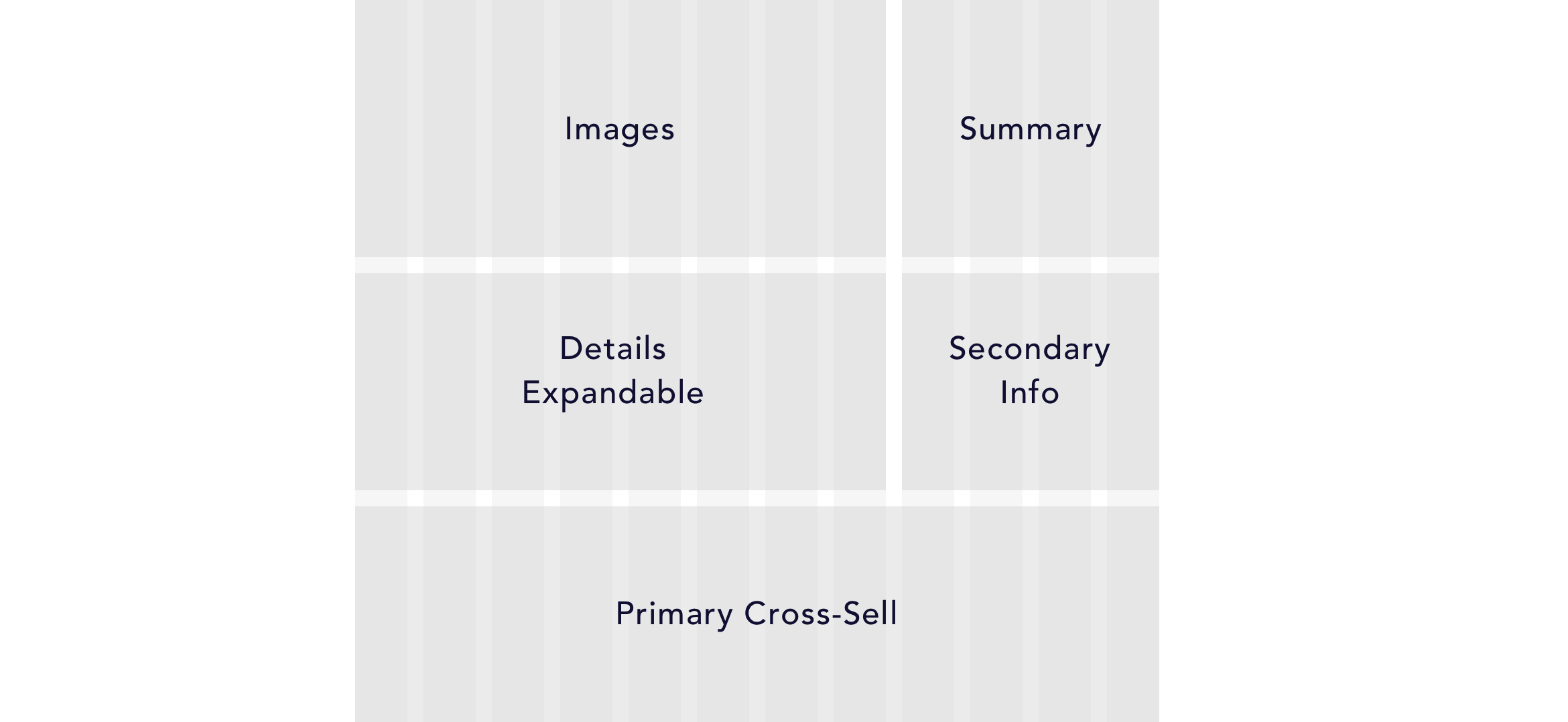
Information Layout
To make sure my design can be easily reused for other product detail pages on our website, I defined a layout that works for all different tyles of products on our website.
A/B Tests and Results
Originally, we were going to launch all 3 pages at once to have a complete A/B test comparison between the redesigned path and the current path. However, due to resource constrains and timeline pressure, we decided to launch them as three separate tests and all in the "MVP - Minimum Viable Product" version. Follow-up tests are scheduled to add the contents that are left out from MVP.
As of 1/31/2019, we've completed the A/B testing of 2 pages in my redesign: Ring Style Details Page and Complete Ring Review Page. Diamond Details Page is still under development.
Ring Styles Details Page
Overall, the new design is a winner in the test. The new design shows a +7.58% lift in conversion rate across new and returning customers. Click rate for both cross-sell sections on this page are up, especially on mobile. Click rate on "create your perfect pair" ins +7.9% on desktop and +68.7% on mobile. Click rate for "similar settings" section is +46.2% on mobile, though -9.5% on desktop. This is a follow-up task in my queue.
Diamond Details Page
Development in process.
Complete Ring Review Page:
According to our recent data analysis, overall, the new design is showing a +7.89% lift in conversion rate. Other matrics are still being analyzed.